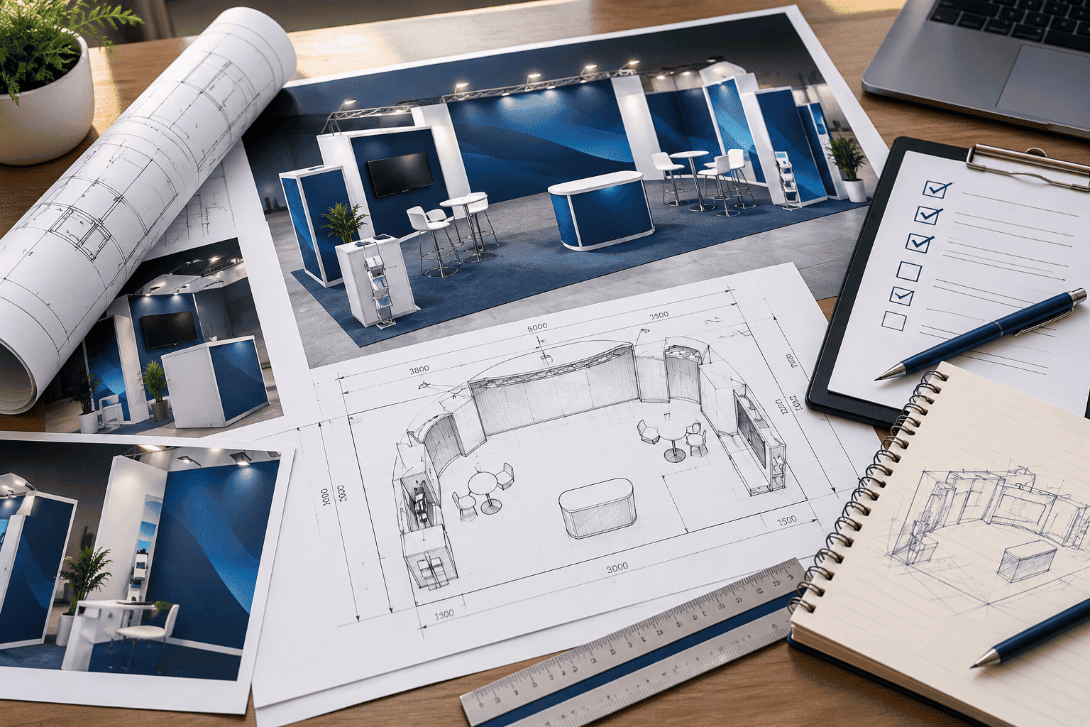
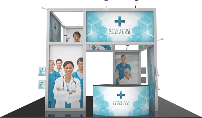
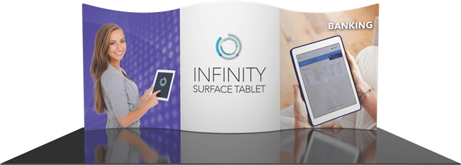
The 10x10 is the most common trade show footprint in the industry, and also the easiest to get wrong.
With 100 square feet to work with, every layout decision - where the backwall goes, whether you add a
counter, how much open floor you leave - changes how the booth actually performs on the show floor.
Here's how to plan a 10x10 that looks bigger than it is and still does its job.
What Actually Fits in a 10x10 Space
Most convention centers pipe and drape a 10x10 booth with an 8ft back wall and 3ft side rails, so your
usable footprint is a 10ft-wide, 10ft-deep box with one open side facing the aisle. That's enough room
for a full-width graphic backdrop, a counter or two, a monitor, and a small amount of storage - but not
much beyond that. The mistake most first-time exhibitors make is trying to fit a 20x20 booth's worth of
furniture, literature and staff into a 10x10 space, which ends up making it feel cramped instead of
inviting.
The better approach is to decide on one primary job for the booth - a graphic backdrop that stops people
walking by, a product demo, or a lead-capture conversation - and design the layout around that single
job instead of trying to do everything at once.
Four Layouts That Work in 100 Square Feet
Nearly every 10x10 booth we build falls into one of four basic layouts. Which one fits your show depends
on whether you're demoing a product, capturing leads, or simply building brand awareness.
Navy bar marks the graphic backwall; gold shapes mark furniture; dashed line marks the aisle-facing open side.
Straight Backwall
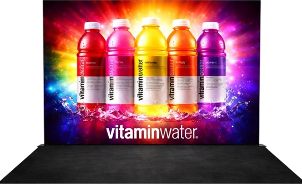
A full 10ft-wide printed backwall with nothing else in the space. This is the simplest and most
cost-effective 10x10 layout, and it works best when the goal is pure visibility - getting your brand and
message in front of as many people walking the aisle as possible. It also leaves the entire floor open,
which makes a small booth feel less crowded.
Backwall + Counter
Add a counter in front of the backwall and you've turned a passive display into a place where a
conversation can happen. This is the layout we recommend most often for exhibitors whose main goal is
lead capture, since the counter gives attendees a reason to stop and staff a place to have a
conversation without blocking the aisle.
Pop-Up + Kiosk
Pairing a pop-up display with a small monitor kiosk works well if you have a product or software demo to
show. The kiosk becomes the focal point, and the pop-up graphic behind it reinforces your branding
without competing for attention.
Backwall + Literature Rack
Tucking a literature rack into a back corner keeps the booth self-serve friendly for attendees who want
information but don't want a sales conversation. It's a small addition, but it matters at shows where
foot traffic is high and staff time is limited.
How to Make a 10x10 Feel Bigger Than It Is
Square footage is fixed, but perceived size isn't. A few design decisions make a 10x10 feel far more
open than the tape on the floor suggests. Keep the color palette simple - two or three colors read as
clean from a distance, while five or six start to look cluttered by the time someone is 15 feet away.
Use vertical space instead of floor space wherever you can: a tall backwall graphic or a hanging sign
draws the eye up and makes the booth feel taller without taking up any additional floor. And keep sightlines
open from the aisle all the way to the back of the booth - a tall kiosk or rack placed dead center blocks
the view and makes the space feel like a hallway instead of a room.
Lighting matters more than most exhibitors expect. Convention center ambient lighting is often dim and
flat, so a backlit graphic or a couple of accent lights aimed at your backwall will make your booth stand
out against neighboring booths that didn't bother, for a relatively small add-on cost.
Choosing a Display System
For a 10x10, the three most common display systems are tension fabric pop-ups, backlit hop-ups and
truss-based kits, and each trades off differently between weight, cost and visual impact.
Tension fabric pop-ups are the lightest and fastest to set up - most collapse into a
single rolling case and can be built by one person in under 20 minutes. That makes them a good fit if
you're shipping the booth yourself, working with a small booth staff, or exhibiting at several shows a
year where fast turnaround matters more than a dramatic visual statement.
Backlit hop-up and lightbox displays add visual punch from across the hall, since an
illuminated graphic reads as brighter and more premium than a flat printed one, especially under the dim
ambient lighting common in convention halls. They cost more than a standard tension fabric pop-up and
need an accessible power drop, but for a product launch or a competitive show floor, the extra visibility
is often worth it.
Truss-based kits are more modular, built from an aluminum frame that graphic panels and
monitor mounts attach to. They take longer to install than a pop-up - usually with two people and 45
minutes to an hour - but the same frame components can often be reconfigured into a 10x20 or larger
footprint later, which makes truss a reasonable choice if you expect to grow your booth size within a
year or two. If you're not sure which system fits your show calendar and budget, our
trade show booth cost guide breaks down starting prices for
each option, both to buy and to rent.
Staffing a Small Booth
A 10x10 booth works best with two staff members on the floor at a time - enough to greet attendees and
hold a conversation without crowding the space or leaving the booth unstaffed during a break. More than
three people in a 10x10 tends to make the booth feel congested to visitors deciding whether to walk in.
If your team is larger, stagger shifts so the booth never feels empty or overcrowded, and keep a clear
spot near the counter or kiosk where a visitor naturally knows to stand while staff scan a badge or note
down contact details.
Common 10x10 Mistakes to Avoid
Too much furniture. A counter, two kiosks and a literature rack in the same 100 square feet leaves no room to actually stand and talk to visitors.
Text-heavy graphics. Attendees read a backwall from 10-15 feet away while walking. One headline and a strong image outperform a paragraph of copy every time.
Blocking the open side. Keep furniture off the aisle-facing edge so people can see - and walk - into the booth.
Skipping the storage question. Even a small booth needs somewhere to stash bags, extra literature and personal items out of sight - a counter with a closed cabinet solves this without adding floor space.
Ordering graphics at the last minute. Rush production is available, but a design that's rushed through approval is far more likely to ship with a typo or a low-resolution photo that looks blurry once it's printed at full size.
Forgetting the view from the side aisles. Corner and end-cap booths get seen from two directions, not one - if your booth is on a corner, make sure the side panel carries your branding too, not just the main backwall.
What a 10x10 Booth Costs
A custom 10x10 booth typically starts from $8,000 to purchase, including the structure, graphics and a
trade show backdrop. If you only need the booth for one or two shows a year, renting is usually the more
cost-effective route, with 10x10 rental kits starting from $800 and including custom graphics and
delivery. You can see the full breakdown, including 10x20 and 20x20 pricing, in our
trade show booth cost guide.
20x20 Island Booth Layout Guide
By Trade Show Displays US · 8 min read
20x20 Island Booth Layout Guide
A 20x20 island booth is open on all four sides, which is exactly what makes it harder to design than a
10x10 or 10x20. There's no single backwall to lean on - every side is a front door, and traffic can
approach from any direction. Here's how to plan the floor space, structure and flow of a 20x20 island so
it works from every angle instead of just the one you designed for.
Why Island Booths Are Different
In a linear 10x10 or 10x20, one wall does most of the work: it carries your main graphic, faces the
aisle, and gives the booth a clear front and back. A 20x20 island has no back - attendees can walk in
from any of the four open sides, which means your layout has to work as a 360-degree space instead of a
single storefront. That's also what makes an island booth so effective at a large show: it captures foot
traffic moving in every direction across the hall, not just down one aisle.
The tradeoff is complexity. A 20x20 needs a real floor plan, not just a backdrop and a table, and it
usually needs overhead structure - a hanging sign or tower - so attendees can find you from across a
crowded hall.
A Working 20x20 Floor Plan
Most successful 20x20 islands split the 400 square feet into four functional zones instead of treating
it as one open room: a reception or greeting area near the busiest entrance, a product or demo zone
toward the center, a meeting or seating area tucked toward one corner for longer conversations, and a
storage or staff area kept out of sight in the back corner opposite the busiest aisle.
Four aisles surround the booth on every side. Gold zones face traffic; the storage zone sits in the quietest corner.
Overhead Structure: Towers and Hanging Signs
Because a 20x20 has no wall to carry a tall graphic, most islands rely on a center tower or a hanging
sign suspended from the venue's rigging points to give the booth height and make it visible from across
the hall. A tower also gives you a natural center point to build the rest of the layout around - reception
near the busiest entrance, demo space along the next-busiest side, and quieter zones like meetings and
storage tucked into the corners that get the least foot traffic.
Most convention centers require rigging plans and sign-off in advance for anything hung from the ceiling,
so overhead elements need to be planned and approved earlier in the process than the rest of the booth -
often six to eight weeks before the show, not the week of.
Managing Flow on All Four Sides
With four open sides, it's easy to end up with dead space in the middle that nobody actually walks
through. A few habits keep traffic moving through the whole booth instead of just around the edges:
Keep at least one clear sightline from each side to the center tower, so attendees approaching from any direction can immediately see where the booth's focal point is.
Angle furniture toward the busiest aisle rather than squaring everything to the booth's own grid - a counter angled 30-45 degrees toward heavy foot traffic gets noticed more often than one facing straight ahead.
Separate quiet and loud zones. A meeting area placed right next to a product demo with audio or video will lose every conversation to the demo's noise.
Leave real walking paths between zones - at least 4-5 feet - so the space reads as a booth people can move through, not a maze of furniture.
Graphics for a 20x20 Island
Because an island booth is seen from every direction, graphics need to work as a set rather than as a
single backdrop. Plan for at least three viewing angles: what someone sees approaching from the main
aisle, what they see from the side while walking past, and what they see looking down from a mezzanine
or second-floor walkway if the venue has one. Large graphics on a center tower are the most efficient way
to cover all three, since a tall tower is visible from every angle at once, while side panels and counter
graphics can carry more detail for people who are already close enough to read it.
Keep your logo and core message consistent across every panel. It's tempting to use the extra square
footage of a 20x20 to tell a longer story across different walls, but attendees typically only see one or
two sides of the booth before deciding whether to walk in, so each side needs to work on its own.
Common Island Booth Mistakes
Designing for one "front." Treating one side as the real entrance and the other three as afterthoughts wastes the biggest advantage of an island - visibility from every aisle.
Underestimating rigging lead time. Hanging signs and towers need venue approval well before the show; requesting rigging the week of setup is a common and avoidable delay.
Too much empty space in the middle. A 20x20 with all the furniture pushed to the edges can end up feeling like four small booths around an empty square instead of one large one.
No plan for storage. With more staff and more literature than a 10x10 or 10x20, an island booth needs a real storage zone - not just a box under a table.
Purchase vs. Rental for a 20x20
A custom 20x20 island typically starts from $30,000 to purchase, which includes the expanded structure,
graphics, meeting and display areas, and hanging banners. If you're testing a larger footprint before
committing to owning one, a 20x20 island rental exhibit starts from $21,000 and includes premium graphics
and on-site support, which is often the better choice for a first large show or for an exhibit you'll only
need once or twice. Larger or fully custom island designs are quoted individually - see our
trade show booth cost guide for the full breakdown across every
booth size.
Planning Timeline for an Island Booth
Because a 20x20 involves more design, structural engineering and often rigging approval than a smaller
linear booth, it needs a longer lead time. Start the design and quote process at least eight to ten weeks
before your show date, confirm any hanging or rigging elements with the venue by week six, and build in a
week of buffer before shipping for final graphics approval. Booths ordered closer to the show date are
still possible with rush production, but they leave far less room to fix a layout problem once you see
the space rendered in 3D.
A 3D rendering is worth insisting on before production starts on a booth this size. At 400 square feet,
a layout mistake is expensive to fix after the fact - moving a wall in a rendering costs nothing, moving
it after the structure has been built costs real time and money. Ask to see your island from all four
approach angles before you sign off, not just the one hero angle most renderings default to.
Booth Checklist
By Trade Show Displays US · 7 min read
Trade Show Booth Checklist: 8 Weeks to Show Day
Most trade show delays don't come from the booth itself - they come from the things around it: a
drayage form filed late, graphics approved with a week left instead of three, or a rigging request the
venue can no longer accommodate. This eight-week checklist covers the decisions and deadlines that
actually determine whether your booth ships on time and arrives ready to set up.
The Eight-Week Timeline
Every show is different, but the sequence below holds for almost any booth size. The earlier deadlines -
design and quote - have the most flexibility if something shifts. The later ones, especially shipping and
show services, do not.
Weeks 8-7
Consultation & Quote
Confirm booth size, budget and show goals. Request a detailed quote.
Weeks 6-5
Design & Approval
Review layout and graphics. Approve final artwork for production.
Week 4
Show Services
Order electrical, carpet and material handling before deadline pricing ends.
Week 3
Production
Graphics print and the booth is built and quality-checked.
Weeks 2-1
Ship & Confirm
Booth ships to the show or advance warehouse. Confirm staff travel and setup crew.
Timeline shown counts down from 8 weeks before your show date.
8-7 Weeks Out: Consultation and Quote
This is when you lock in the basics: booth size, whether you're buying or renting, and a realistic
budget. If you haven't compared costs yet, our trade show booth
cost guide breaks down real starting prices by size so you can request a quote that's already in the
right range instead of going back and forth on budget later. This is also the point to decide on
installation and dismantling - most exhibitors have their booth vendor handle it, but if you're managing
it yourself, you need to know that now, not the week of the show.
6-5 Weeks Out: Design and Graphics Approval
Once the quote is signed, design moves fast - but graphics approval is the single most common place a
timeline slips. Every round of revisions costs days, so review the layout and graphics carefully the
first time: check booth dimensions against your actual product or demo equipment, check that your logo
and message are legible from aisle distance, and check spelling and contact details on every panel before
signing off. Once artwork is approved for production, changes get expensive and slow.
Week 4: Order Show Services
This is the deadline exhibitors forget most often. Convention centers and show decorators set an "advance
order" deadline - usually three to four weeks before the show - after which electrical, carpet, internet
and material handling all jump to a higher, on-site rate. Ordering electrical and carpet by week four
instead of waiting until move-in can be the difference between a predictable show services bill and one
that comes as a surprise. If you're not sure what counts as a show service versus what's included in your
booth, this is worth a call to your booth provider before the deadline passes.
Week 3: Production
With graphics approved and show services ordered, this week is production: printing, booth assembly and
quality checks. There's little for you to do here except be reachable in case a question comes up, but
it's a good time to confirm your show services orders went through and to finalize who's traveling to the
show and when.
Weeks 2-1: Shipping and Final Confirmations
The booth ships to the show site or an advance warehouse, depending on the venue's requirements and your
move-in schedule. Advance warehouse shipping arrives earlier and gets placed in your booth space ahead of
move-in, which reduces risk if there's a shipping delay - direct-to-show shipping is faster and cheaper
but leaves less buffer if something goes wrong in transit. This is also the point to confirm booth staff
travel, print any last-minute literature, and pack a small on-site kit: extra business cards, tape, a
basic tool kit and contact information for your booth provider in case anything needs adjusting on-site.
Show Week: What to Expect
If the earlier weeks went to plan, show week is mostly about execution: installation and dismantling
happens on the schedule set weeks earlier, your team arrives with a clear understanding of the booth
layout, and show services are already paid for at the advance rate. Keep your booth provider's contact
information on hand during move-in - a small fix on-site is far easier to resolve with the team that built
the booth than by improvising with whatever's on hand at the convention center.
What If You Only Have Four Weeks?
Sometimes a show comes up with less than eight weeks of notice. It's not ideal, but it's workable if you
compress the right steps and skip the wrong ones. Combine consultation and design approval into one fast
round instead of two - come to the first call with your booth size and budget already decided so there's
no back-and-forth. Choose a rental over a custom build if you haven't already, since rental kits are
typically pre-engineered and only need graphics production, which is the one step you can't rush past a
certain point without risking quality. And call the show decorator directly to confirm the show services
deadline hasn't already passed - a compressed timeline is much harder to manage if you're also paying
on-site rates for electrical and material handling because an advance deadline slipped by unnoticed.
Don't Forget Booth Staff Prep
A booth that ships on time can still underperform if the staff working it weren't briefed. Somewhere in
weeks two and one, walk your team through the actual floor plan - where the counter is, where literature
lives, where the demo happens - so nobody is finding their way around the booth for the first time in
front of an attendee. Cover the basics: your core talking points, how to qualify a visitor in under a
minute, and what "counts" as a lead versus a casual conversation, so everyone is capturing information
the same way. If badge scanners or a lead-capture app are part of your setup, make sure every staff member
has tested it before show day, not during the first hour of the show.
It also helps to assign one person as the point of contact for anything that comes up on-site - a
graphic panel that arrived with a scuff, a monitor that won't power on, a question from the show
decorator. Having one clear owner instead of everyone assuming someone else will handle it is a small
thing that prevents a lot of on-site scrambling.
The One Habit That Prevents Most Delays
Almost every late trade show booth traces back to a decision that got pushed back "for now" - graphics
approval, a show services order, a rigging request - and then ran into a deadline that had already
passed. The eight-week timeline above isn't strict because a booth provider wants a strict process; it's
strict because it's built around real deadlines set by venues and show decorators that don't move for
anyone. Treating week four's show services deadline and week six's graphics approval as fixed dates, not
flexible ones, is the single habit that prevents the most common show-week problems.
How to Get More Booth Traffic
By Trade Show Displays US · 8 min read
How to Get More Booth Traffic
A great booth with no visitors is just an expensive piece of furniture. Getting people to actually stop,
walk in and talk to your team comes down to four things working together: what catches their eye, what
keeps them engaged, how you capture their information, and what happens after the show. Here's how to
work on all four.
Traffic Is a Funnel, Not an Accident
It's tempting to think of booth traffic as luck - some aisles are just busier than others. Traffic
matters, but what you do with it matters more. Every visitor who walks past your booth moves through the
same four stages whether you plan for them or not: they notice you (or don't), they decide whether to
engage, you capture their information (or you don't), and afterward you either follow up or the
conversation goes nowhere. Treating booth traffic as a funnel you can design for, rather than something
that just happens to you, is the difference between a booth that fills a badge scanner and one that
doesn't.
Each stage of the funnel needs a plan - a booth that only invests in one stage leaks visitors at the others.
Stage 1: Attract - Getting Noticed From the Aisle
Attendees decide whether to look at your booth in about two or three seconds while walking past, which
means your graphics need to communicate at a glance, not a read. One clear headline and a strong image
outperform a paragraph of copy every time, because nobody stops walking to read a paragraph from ten feet
away. Height and lighting help too - a tall graphic or hanging sign is visible from further down the
aisle than a display at eye level, and a backlit or well-lit graphic stands out against neighboring
booths that didn't invest in either. If your booth is on a corner or end-cap, make sure the side panel
carries your branding as well as the front, since corner booths get seen from two directions, not one.
Stage 2: Engage - Giving People a Reason to Stop
Getting noticed only helps if there's a reason to actually walk in. A live product demo, a short
interactive element, or simply a staff member who greets people instead of standing behind a counter
looking at their phone all make the difference between someone glancing and someone stopping. Keep your
booth staffed by people who can speak knowledgeably about your product in plain language - attendees can
tell within a few sentences whether they're talking to someone who can actually help them, and they
disengage quickly if not. A 10x10 booth works best with two staff on the floor at a time; more than three
tends to make a small space feel crowded to visitors deciding whether to walk in.
Engage · Capture
Promotional Giveaway Items: Use Them to Start Conversations
A giveaway is one of the cheapest ways to give a visitor a reason to step out of the aisle. The trick is
treating it as a way to start a conversation, not a pile of free stuff on the counter. Items left in a
bowl get grabbed by people who keep walking; items handed over after a quick question, a demo or a badge
scan reach the people you actually want to talk to.
1
Make them earn it
Ask for a badge scan, a quick demo or one qualifying question first. A $2 item then rewards a conversation you can track, instead of walking out the door with someone who never stopped.
2
Pick items people keep
Quality pens, tote bags, webcam covers, charging cables or power banks get used at a desk or on a flight. Add your logo, booth number and web address so the item sends people back to you.
3
Show it from the aisle
Keep a sample on the counter or a shelf near the aisle edge, with a sign that says how to get one, so the offer reads at a glance.
Plan quantities and budget in three tiers
Booth floorlowest cost per itemPens, totes, webcam covers. Enough for roughly a quarter to a half of expected attendance.
Qualified leadsmid-range per itemA better item, handed over after a real conversation or a booked demo.
Top prospectspremium, few in numberA few premium gifts or a raffle prize, given to your best-fit accounts.
A quick way to judge whether it worked
Divide your total giveaway spend by the number of conversations your team scored as warm or hot.
Spend $2,400, come home with 60 qualified conversations, and each one cost you $40. Compare that
number show to show instead of counting how many items you handed out.
Mistakes that waste the budget
Buying on price alone. A flimsy pen or a bag that rips gets thrown away, and it leaves a poor impression of your brand with it.
Choosing something everyone already has. Another generic stress ball or lanyard ends up in the hotel bin. Pick something useful for your audience, such as a branded cable organizer for an IT show.
Leaving items in a bowl. Visitors grab one and keep walking. Hand the item over as part of a conversation.
Running out on day one. Hold some stock back for the middle and end of the show, once attendees have walked the floor, so the booth stays busy past the opening rush.
Raffles work well for the top tier because you need a name and an email to enter, which feeds the
capture stage directly. Just make sure the prize suits the people you want to meet: a tablet appeals to
almost everyone, so qualify the entries afterwards.
Stage 3: Capture - Turning a Conversation Into a Lead
A great conversation that isn't recorded anywhere is a lead you'll never follow up with. Badge scanners
are the fastest way to capture contact details without interrupting the flow of a conversation, but the
scan alone isn't enough - train staff to jot a one-line note about what the person cared about right after
the conversation, while it's still fresh. "Scanned 40 badges" is a much weaker result than "scanned 40
badges, with notes on what each one actually wants," because the notes are what make follow-up feel
personal instead of generic. Decide in advance what counts as a qualified lead versus a casual
conversation, so every staff member is capturing information the same way instead of everyone using their
own judgment.
Stage 4: Follow Up - Where Most Leads Actually Get Lost
More leads are lost after the show than during it. A badge scan that sits untouched for two weeks has
already lost most of its value, since the attendee has moved on to the next show, the next vendor
conversation, or simply forgotten the specifics of what you talked about. Aim to send a follow-up within
48 hours of the show ending, referencing the specific note taken during the conversation rather than a
generic template. If your team captured 100 leads and only 20 get a personal follow-up, the other 80
conversations - and the booth cost that helped create them - were largely wasted.
Traffic Starts Before the Show
The most effective booth traffic doesn't start on the show floor - it starts with attendees who already
knew to look for you before they arrived. Emailing your customer list and prospects with your booth
number a week or two before the show, posting on social media that you'll be exhibiting, and mentioning
it in any newsletter or sales conversation that happens to fall in that window all turn a walk-by into a
visit from someone who came looking for you specifically. Those pre-planned visits convert into
conversations at a much higher rate than cold foot traffic, since the attendee has already decided you're
worth their time before they get to your booth.
If you have existing customers who'll also be at the show, a short personal invitation - even just a
one-line email - is worth the five minutes it takes to send. A customer who stops by specifically to say
hello is also far more likely to bring a colleague or make an introduction to someone else worth talking
to.
The Booth Itself Still Matters
None of the four stages work as well in a booth that isn't designed with them in mind. A cluttered layout
with no clear sightline hurts the "attract" stage before anyone even gets close enough to engage. A booth
with nowhere for a conversation to happen - no counter, no seating, no open floor - makes "engage" harder
than it needs to be. If your current booth is working against you at one of these stages, our
custom trade show exhibits and
booth rental options are both built around the same
layouts and display systems covered in our other planning guides, so the booth itself supports the funnel
instead of working against it.
A Simple Way to Audit Your Last Show
If you've exhibited before, it's worth a short debrief after your next show while it's fresh: how many
people walked past versus how many walked in, how many conversations turned into a badge scan, and how
many scanned leads actually got a follow-up email. Most exhibitors can point to exactly one stage where
the funnel leaks the most - often follow-up - and fixing that one stage usually produces a bigger
improvement than redesigning the whole booth from scratch.
Tension Fabric vs Pop-Up vs Truss
By Trade Show Displays US · 8 min read
Tension Fabric vs. Pop-Up vs. Truss: Which Display System?
Nearly every trade show display is built on one of three underlying systems: tension fabric, pop-up
frame, or aluminum truss. The graphics on top might look similar in a rendering, but the system underneath
determines how much your booth weighs, how long it takes to set up, and how easily it can grow with you.
Here's how the three actually compare.
The Three Systems at a Glance
Before comparing details, it helps to know what each system actually is. Tension fabric displays use a
lightweight frame with a stretch-fit fabric graphic pulled tight over it, similar to a fitted sheet.
Pop-up displays use a spring-loaded, zigzag-folding frame that expands into a curved or flat wall shape,
with panel graphics attached magnetically or with fabric that hooks in place. Truss displays use straight
aluminum tubes and connector hubs - the same building blocks used in stage and lighting rigs - assembled
into a custom frame that graphic panels, monitors and shelving attach to.
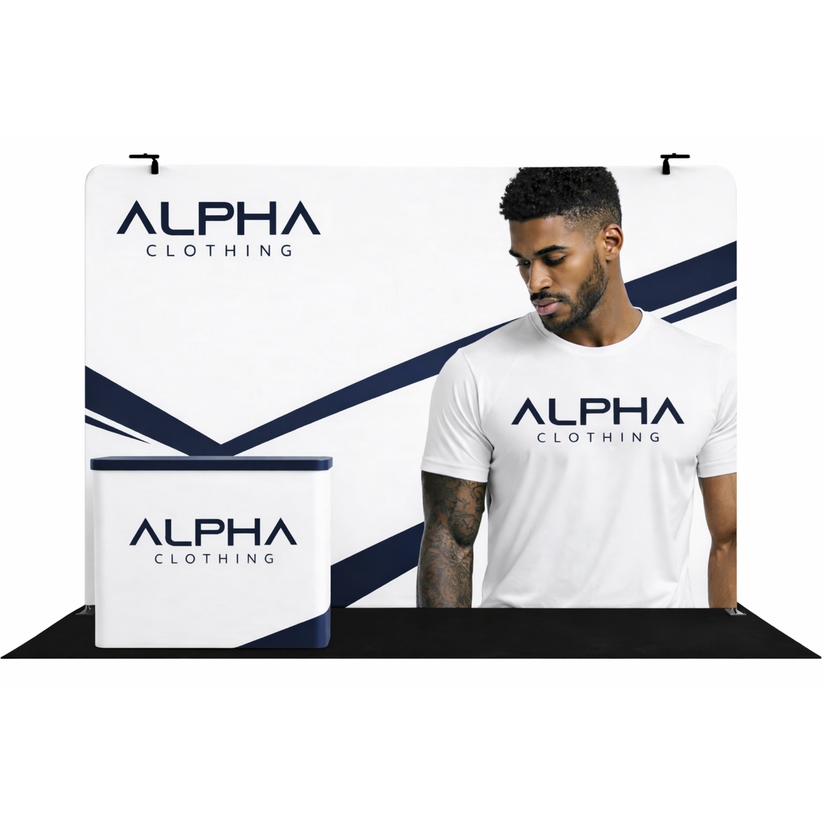
Tension FabricLightest · fastest setup
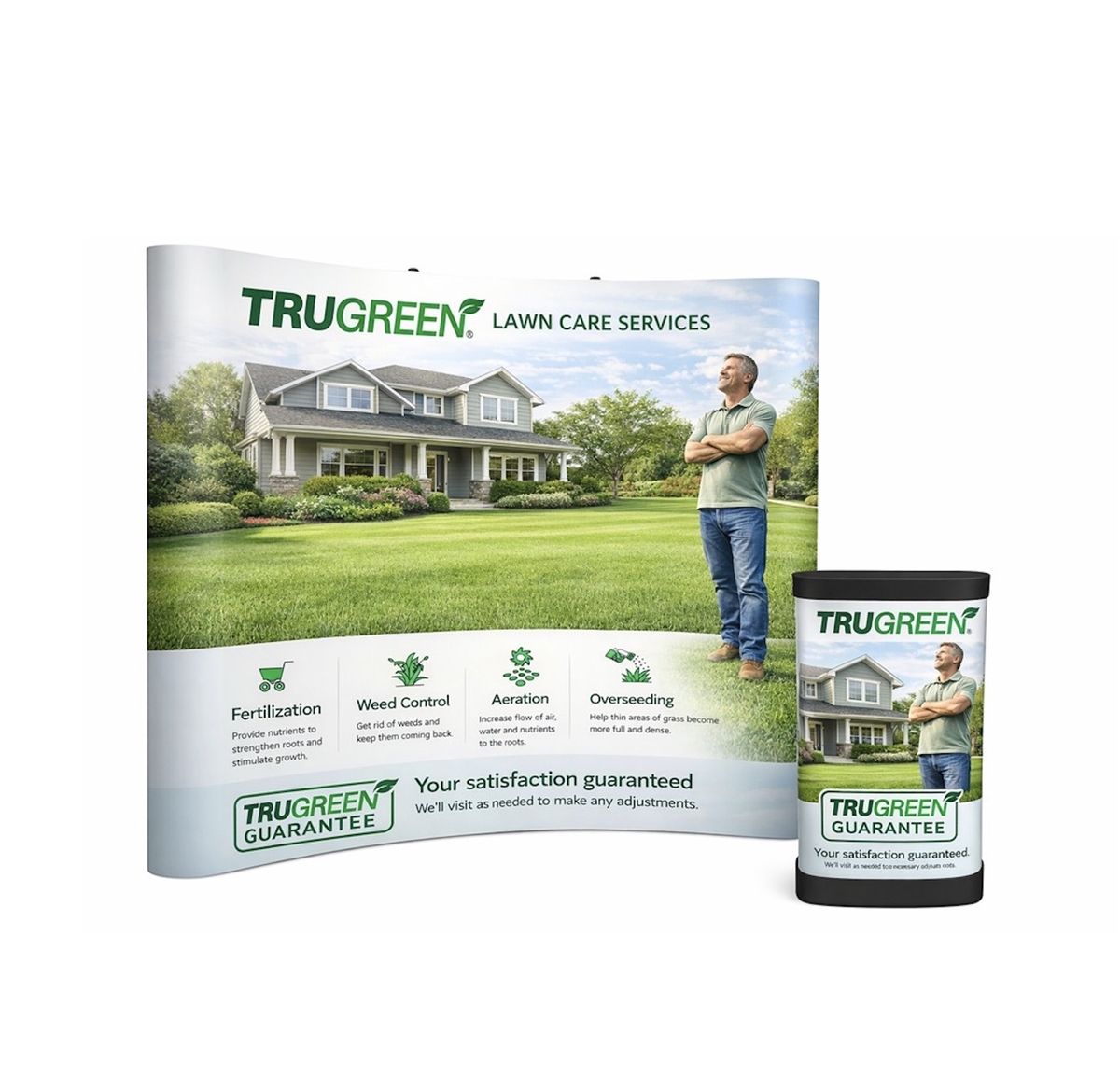
Pop-Up FrameBalanced weight & visual impact
Aluminum TrussMost modular & reconfigurable
Tension fabric, pop-up frame and aluminum truss display systems side by side.
Weight and Portability
Tension fabric is the clear winner if weight is your main concern. A full 10ft fabric display, frame and
case included, is often light enough for one person to carry and check as standard airline luggage. Pop-up
frames are a step heavier because of the folding hardware, but still well within what one or two people can
handle without equipment. Truss is the heaviest of the three - the aluminum tubing and connector hubs that
make it modular also make it the system you're most likely to ship as freight rather than carry on yourself.
Setup Time
Tension fabric displays are built for speed: most 10ft displays go from case to fully built in 15-20
minutes with no tools, which is why they're the default choice for exhibitors setting up their own booth
without a labor crew. Pop-up frames are similarly fast - the frame itself opens in minutes, though
attaching separate panel graphics adds a bit of time compared to a single fabric skin. Truss takes the
longest, typically 45 minutes to over an hour for two people, since each connector has to be assembled by
hand - but that same hands-on assembly is what makes a truss frame reconfigurable into different shapes
and sizes later.
Visual Impact
All three systems can look excellent when the graphics are done well, but they create different
impressions. Fabric graphics have a soft, matte finish and can wrap seamlessly around curves, which reads
as clean and modern from a distance. Pop-up panel graphics tend to have crisper edges between panels and
support backlighting more easily, which adds visual punch under convention hall lighting. Truss structures
have the most visual depth and dimension - monitors, shelving and hanging elements can all attach directly
to the frame - which is part of why truss is the more common choice for larger 10x20 and 20x20 booths that
need to stand out from across a hall.
Cost and Reconfigurability
Tension fabric is generally the most affordable system for a given booth size, both to buy and to
replace graphics on later, since a new fabric skin costs less than reprinting a full panel set. Pop-up
frames sit in the middle. Truss costs more upfront because of the hardware and labor to design a custom
frame, but it pays off over time if you exhibit at multiple show sizes - the same connector hubs and tube
sections used in a 10x10 truss kit can often be reconfigured into a 10x20 or added to for a 20x20,
whereas a fabric or pop-up display generally has to be replaced outright to change size.
Mixing Systems: Hybrid Displays
You don't have to pick just one system for the whole booth. Hybrid displays combine a truss frame with
fabric or panel graphics, giving you the structural strength and reconfigurability of truss with the
lighter weight and faster graphic changes of fabric. This is a common choice for exhibitors who want a
truss-level visual presence - shelving, monitor mounts, hanging elements - without committing to the full
setup time and weight of an all-truss build. If you're weighing the tradeoffs above and can't quite decide,
a hybrid system is often the practical middle ground.
Durability and How Long Each System Lasts
All three systems are built for repeated use, but they age differently. Fabric graphics are the most
prone to visible wear over time - creasing from repeated folding and packing is normal, and very bright
or saturated colors can fade slightly faster under repeated show lighting than a rigid panel would. Most
fabric skins hold up well for two to three years of regular use before a refresh makes sense. Pop-up panel
graphics are more rigid and resist creasing better, typically lasting three to four years before edges or
corners start to show handling wear. Truss frames themselves are essentially permanent - the aluminum tube
and connector hardware can last well over a decade - so the "lifespan" question for truss is really about
the graphics attached to it, which can be reprinted and swapped independently of the frame whenever your
branding changes.
Storage Between Shows
Storage needs scale with the system. A fabric display packs into a single rolling case small enough for
an office closet or a car trunk, which is part of why it's popular with exhibitors who don't have
warehouse space. Pop-up frames need a slightly larger case due to the folding hardware, but are still
manageable in a standard storage unit. Truss components disassemble into individual tubes and connectors
that pack into road cases - manageable, but bulkier, and worth planning for if you're storing the booth
yourself between shows rather than using a storage and logistics
provider.
Which System Fits Your Show Calendar
If you exhibit at one or two shows a year and value simplicity, tension fabric is usually the easiest and
most cost-effective choice. If you want a bit more visual punch and backlighting without a big jump in
setup complexity, a pop-up display is a solid middle ground. And if you exhibit frequently, at different
booth sizes, or need to attach monitors and shelving directly to the structure, truss is worth the higher
upfront cost and longer install time for the flexibility it gives you later. You can compare real starting
prices for each system, along with purchase and rental options by booth size, in our
trade show booth cost guide.
Trade Show Blog & Planning Resources
Trade Show Planning Resources & Guides
Booth Ideas, Layouts, Costs and Show-Day Checklists
From choosing the right booth size to preparing your graphics files, our guides help you plan a trade
show booth with confidence. Explore real layouts, pricing and planning advice from our team.
Trade Show Graphics File Prep: Sizes, Bleed & Resolution
A design that looks sharp on a laptop screen can print blurry, miscropped or off-color at trade show
scale if the file underneath isn't set up correctly. Here's how to prepare artwork so what you approve on
screen is what actually comes off the printer.
Why File Prep Matters More at Trade Show Size
Trade show graphics print far larger than almost anything else your design team produces - a single
10ft backwall panel can be six feet tall, and a 20x20 tower graphic can run even larger. Mistakes that are
invisible on a business card or a web banner become obvious at that scale: a slightly low-resolution photo
turns visibly soft, text set too close to the edge gets trimmed off, and a color that looked right on a
monitor can shift once it's printed. Getting the file right before it goes to print is far cheaper than
reprinting after a booth graphic arrives with a problem you could have caught in the design file.
Resolution: What "High-Resolution" Actually Means Here
Large-format printing doesn't need the same resolution as a printed photograph you'd hold in your hand,
because viewers stand much further away from a trade show graphic than they would from a printed photo.
All raster files - whether they're the final print file or images linked into a layout - should be
supplied at 100-120 pixels per inch at 100% of the final print size. That's lower than the 300 DPI you
might be used to for a brochure, but it's calculated for actual viewing distance, and going higher just
means unnecessarily large files without any visible improvement once the graphic is printed and hung.
The common mistake here isn't using too low a resolution - it's scaling a smaller image up to fit a much
larger canvas after the fact. A photo that's 100 PPI at its original size becomes 25 PPI if you stretch it
to four times its size in your layout software, and that loss of quality is exactly what shows up as soft
or pixelated once it's printed at full scale. Always place images into your layout at or near their
intended final size, not scaled up from something smaller.
Bleed, Trim and Safe Zone
Every large-format print needs three reference lines: the bleed edge, where your background artwork
extends past the final cut so no white sliver appears if the cut shifts slightly; the trim line, which is
the actual finished edge of the graphic; and the safe zone, an inset margin inside the trim line where
text and logos should stay clear of, in case of minor shifts during production or mounting.
Exact bleed and safe zone measurements vary by display type - always check the graphic template for your specific product before finalizing a file.
Unlike resolution, there's no single bleed measurement that applies to every product - a tension fabric
graphic, a rigid panel and a banner stand each have different bleed and safe zone requirements based on
how they're finished and mounted. Always work from the graphic template for your specific display rather
than assuming a standard bleed size, and when in doubt, ask before you finalize a design rather than after
it's gone to print.
Color: CMYK, RGB and What to Expect
Color specifications depend on the type of file. Vector files built in Illustrator or InDesign should be
supplied in CMYK, which is the standard color model for print production. Raster artwork - Photoshop
files, JPGs and TIFFs - should be supplied in RGB for the most accurate color output once printed. If a
specific brand color needs to match exactly, include the Pantone (PMS) reference in your file; without a
Pantone reference, a hard copy proof, or a requested hard copy proof, color accuracy on large-format prints
can't be guaranteed, since every monitor and every printer renders color slightly differently.
If color accuracy matters for your brand - and for most companies it does - request a hard copy proof
before full production runs. It's a small extra step that catches a color shift while it's still cheap
and easy to fix.
Accepted File Formats
Illustrator, Photoshop and InDesign files (current version or below) are all accepted, though InDesign is
not preferred for large-format graphic production. High-quality, editable PDFs, Photoshop and Illustrator
files are the most suitable formats for large-format printing and are preferred whenever possible. If your
file includes text, either convert the type to outlines before sending it or include the actual font files
along with an editable version of the layout, so nothing shifts or substitutes automatically if the
printer doesn't have your exact font installed.
Common File Prep Mistakes
Pulling images straight from a website. Web images are built for screens at 72 PPI and are almost always too low-resolution once scaled up to trade show size, even if they look fine in a browser.
Ignoring safe zone on curved or wrapped graphics. A tension fabric display that wraps around a frame can distort text placed too close to a seam or corner - keeping important elements in the safe zone matters even more on non-flat surfaces.
Sending a flattened JPG instead of a layered file. If a last-minute text change is needed, a layered, editable file can be fixed in minutes. A flattened image often means starting the design over.
Assuming screen color matches print color. Monitors display color as light; printers reproduce it with ink or dye. Without a Pantone reference or a proof, some color shift between the two is normal, not a printing error.
Skipping the graphic template. Every display has its own bleed, safe zone and panel dimensions. Designing to a generic size instead of your specific product's template is one of the most common causes of a graphic that doesn't fit once it arrives.
A Quick Pre-Flight Checklist
Images placed at or near 100% of final print size, not scaled up from something smaller
Resolution of 100-120 PPI at 100% for all raster files
Bleed and safe zone match the graphic template for your specific display
Vector files in CMYK, raster artwork in RGB
Pantone references included for any brand colors that need to match exactly
Fonts outlined, or font files and an editable layout included
A hard copy or requested proof if color accuracy is critical
If you're not set up to prepare print-ready files in-house, our graphics and printing team
can take your logo and brand assets and build the layout for you, so none of the above falls on your
design team.
How do I buy/redeem a gift certificate?
To purchase a gift certificate for someone, click here. If you are the recipient of a gift certificate and would like to redeem your gift certificate, click here.
How do I find my product?
To find the product(s) you're looking for, you may (1) use the navigation menus on the top, left & bottom of our website. (2) type a keyword into the SEARCH box. If you have any trouble locating a product, feel free to contact customer service for assistance.
How do I navigate the site?
To navigate this website, simply click on a category you might be interested in. Categories are located on the top, left & bottom of our website. QUICK TIP: Place your mouse cursor over anything you think could be a clickable link. You'll notice that anytime you scroll over something that is a link, your mouse cursor will become a "hand". Whereas scrolling over anything that is NOT a link will leave your cursor as an "arrow". You may also type a keyword into the SEARCH box to quickly find a specific product. If you have any trouble locating a product, feel free to contact customer service for assistance.
How do I use a coupon?
After adding items to your cart, click the "View Cart" link at the top of this site to view your cart. At the bottom of the shopping cart you'll see a box where you may enter your coupon code.




 Tension Fabric
 Pop-Up Frame
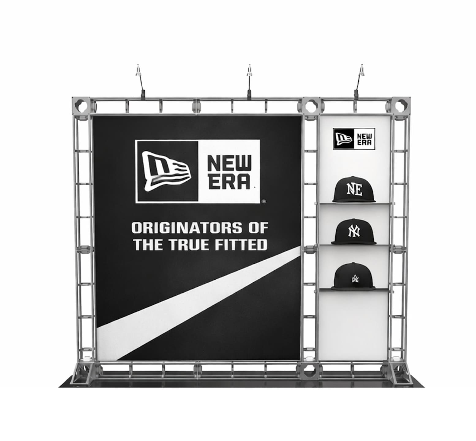 Aluminum Truss